
Codex
Codex is a hybrid of magazine and journal. Beautifully designed, visually appealing, an immersive experience with a lively voice, it is also serious about its subject: authoritative, scholarly at times, but not dry in tone. It’s serious, but not stuffy. It loves the people, tools, and type associated with this craft, from the man carving beautiful cherubim into wood blocks in the 1400s to brilliantly formed modern interpretations and departures. It embraces the web and is watchful for the future’s classics.
4 Piles
1 Wishlist
Other issues
{newwindow=window.open('http://pinterest.com/pin/create/button/?url=http%3A%2F%2Fmagpile.com%2Fissue%2F7819/&media=https%3A%2F%2Fmedia.magpile.com%2Fcovers%2F64%2FCeqN2VhlSM7Md8vj.jpg&description=Codex%2C%20Summer%202013%2C%20%233','name','height=253,width=632');return false;})());)
USD 28.00
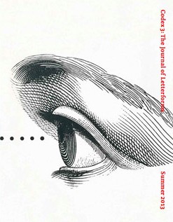
Codex 3 was bursting at the seams again and so we have split the material into two issues with the advertised feature on the classical Roman capital becoming Codex 4 and all of the other material remaining as Codex 3.
This wonderful issue begins with a colorful review by James Clough of the HWT Chromatic Set, the first group of typefaces in the Hamilton Wood Type collection that P22 is digitizing. Next up, Frans Janssen takes a look at the famous 1768 Enschedé type specimen; then an in-depth interview of type designer Freda Sack. Canadian type designer Nick Shinn writes about the hidden history of type in the 20th century, while Greg D’Onofrio and Patricia Belen of Kind Company provide a fascinating & detailed look at Lester Beall’s pioneering corporate identity manual for Connecticut General. Alexander Tochilovsky and Emily Roz follow with a profile of the Herb Lubalin Study Center of Design and Typography at Cooper Union. This is supplemented by a beautiful foldout of Gastrotypographicalassemblage designed by Lou Dorfsman and Herb Lubalin for CBS. Plus a glorious glimpse of the rich architectural and monumental lettering tradition at Yale University, and much more.
What do you think of this issue?
Sign up or Log in to join the discussion.
Recent activity
- 10 Apr, 2015 Added to pile by joelmwakasege
- 14 Jan, 2014 Wanted by iTibz
- 08 Sep, 2013 New cover uploaded by iorio_iorio
- 08 Sep, 2013 Added to Magpile by iorio_iorio
- 08 Sep, 2013 Added to pile by MYMYMY
- 08 Sep, 2013 Added to pile by Wordius
- 08 Sep, 2013 Added to pile by aurelie
- 08 Sep, 2013 Added to pile by iTibz