Slanted
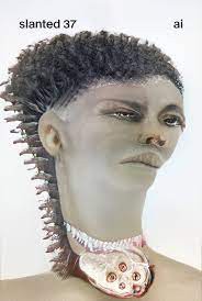
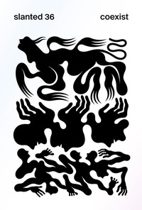
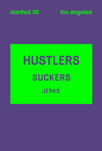
Slanted is a biannually published typography magazine from Germany, running since 2005, covering typography, layout, illustration and photography. Each issue takes a different theme.
“Super Families”
EUR 14.00 — Released 30 August 2012
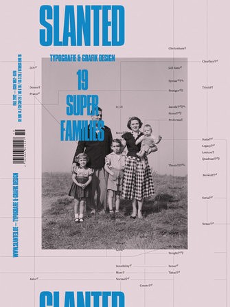
Slanted #19 – Super Families hosts a great family party. In this issue we focus on large font families, and their family trees, displaying an amazing variety. They all have a large amount of weights that features an extreme range, giving a spectacle from Hairline to Ultra Black with Compressed to Extended. Relatives also come in Sans, Serif, Semi-Serif, Slab, Rounded etc.
We are pleased to present a number of readable essays and reports: Unit Gothic & Uniform Set Gothic, wood type as precursor (David Shields Austin TX US), Über Koffer (Frank Wiedemann, Berlin, DE), Japanese Graphic Design: Not In Production (Ian Lynam, Tokyo, JP), On typographic superfamilies (Julia Sturm, Berlin, DE), Eine wie Keine, aber die für alle Fälle! (Maurice van Brast, Weimar, DE), Mr & Mrs Eaves: A Type Family (Emigre, Berkeley CA, US), Jenseits der Interpolation – Entwurf einer Schriftsippe mit Superpolator (Stefan Claudius, Essen, DE) as well as The Kegler Bros by Terry Wudenbachs (Buffalo, NY, US).
In this particular issue there are many wonderful family photographs: Royal Families (thanks to Ken Johnston, Historical Corbis, Brooklyn NY, US), Princesses and Footbal Stars (Daniel Schumann, Erkrath, DE), Alison (Jack Radcliffe, Baltimore MD, US), Life on Both Sides of the Border (Joseph Rodriguez, Brooklyn, New York, US), Stranger Than Family (Matthew Avignone, Chicago IL, US), The Other Family (Nicola Lo Calzo, Paris, FR), A portrait of community life at Castle Tonndorf (Roger Hagmann, Blankenhain, DE), Salt & Truth (Shelby Lee Adams, Pittsfield MA, US), Caches (Sirin Simsek, Cologne, DE), Miner’s Families (Song Chao, Beijing City, CN), Portrait of a Family (Todd Danforth, Blackstone MA, US).
In the interview format 10 × 10, family experts gave answers to 10 questions – with Łukasz Dziedzic (Typoland, Warszawa, PL), Hannes von Döhren (HVD Fonts, Berlin), Peter Biľak (Typotheque, The Hague, NL), Christian Schwartz (Commercial Type, New York City NY, US), Nadine Chahine (Linotype, Bad Homburg, DE), Ian Party (swisstypefaces, Villette, CH), Erik van Blokland (LettError, The Hague, NL), Paul van der Laan (Bold Monday, The Hague, NL) and Yanone (Kromsdorf, DE).
Furthermore, we spoke with Albert-Jan Pool (Hamburg, DE) about the future of FF DIN and what he thinks about other DIN typefaces, Panos Vassiliou about his type foundry Parachute (Athens, GR), Andreas Frohloff and Ivo Gabrowitsch (fontfont, Berlin, DE) about the meaning of big type families for one of the most renowned international type foundries, Olaf Leu (Wiesbaden, DE) about the tasks of type systems, Thomas Marecki (Lodown, Berlin, DE / Blurb, San Francisco CA, US) about their publication “The Icons of Lodown,” Philippe Apeloig (Paris, FR) about his work and what inspires him.
Besides historic family portraits of Corbis, the eight page fold-out cover presents something really special: a family tree of the best type super families, compiled by Indra Kupferschmid.
What do you think of this issue?
Sign up or Log in to join the discussion.
Recent activity
- 18 Nov, 2015 Wanted by kar0lina
- 13 Apr, 2015 Added to pile by acpassarella
- 07 May, 2013 Added to pile by william
- 31 Mar, 2013 Bought from the Magpile Store by cjpurcell
- 10 Mar, 2013 Added to pile by arialcrime
- 18 Feb, 2013 Added to pile by jannickt
- 03 Jan, 2013 Wanted by MiguelNaranjo
- 16 Oct, 2012 Added to pile by chadkouri
- 12 Oct, 2012 New cover uploaded by commodified
- 12 Oct, 2012 Added to pile by NAGD
- 12 Oct, 2012 Added to Magpile by commodified
