
Slanted
Slanted is a biannually published typography magazine from Germany, running since 2005, covering typography, layout, illustration and photography. Each issue takes a different theme.
6 Piles
1 Wishlist
Other issues
{newwindow=window.open('http://pinterest.com/pin/create/button/?url=http%3A%2F%2Fmagpile.com%2Fissue%2F1311/&media=https%3A%2F%2Fmedia.magpile.com%2Fcovers%2F126%2FS8YiS5ESePPgX3Ti.jpg&description=Slanted%2C%20Summer%202011%2C%20%2314','name','height=253,width=632');return false;})());)
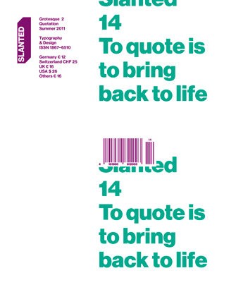
“Grotesque 2: To quote is to bring back to life”
EUR 12.00
While Slanted #13 dealt with contemporary and historical humanist grotesque fonts, Slanted #14 – Grotesque 2 focuses on current fonts that are in tradition of Lineal, Neo- or Geometric Grotesque. They mainly have their origins in the time of the turn of 19th to 20th century. In 1880 Ferdinand Theinhardt designed the Royal Grotesque with four weights for the Königlich-Preußische Akademie zu Berlin, from which developed the Akzidenz Grotesque in 1918. Simultaneously, from 1905 to 1930, Morris Fuller Benton created fonts on the basis of Lineal Neogrotesque: the Lineal Grotesque. Nowadays there can be observed different procedures of designing fonts, which can be named as quotations. A variety of fonts bear on historical models.
With great pleasure we present a huge number of these corresponding and related grotesque fonts, illustrations and projects. The type essays by Flo Gaertner (Karlsruhe), Robert Schumann (Berlin) and Anna Sinofzik (London) deal with them. Worth seeing photos stories are “Almost Europe” by Miguel Hahn and Jan-Christoph Hartung (Frankfurt am Main) who visualize the situation of refugees in the Spanish enclave Melilla, as well as »Ein Abend auf der Wiesn – Pictures taken during the great beer rush« by Volker Derlath (München). Numerous interviews with Lizá Defossez Ramalho and Artur Rebelo (Porto), Edwin van Gelder (Amsterdam), Marta Podkowinska and Karol Gadzala (Krakow) and Hans Gremmen (Amsterdam) as well as an article about Kiyoshi Awazu as well as the 4th part of the Tokyo Report, both by Ian Lynam (Tokyo) and a musical travelogue by Frank Wiedemann (Berlin) round up the stuff to read.
By the way: Slanted #13 and #14 are conceived as a double-issue featuring the wide field of grotesque fonts.
What do you think of this issue?
Sign up or Log in to join the discussion.
Recent activity
- 13 Apr, 2015 Added to pile by acpassarella
- 09 Feb, 2014 Added to pile by MAGASIN
- 07 May, 2013 Added to pile by william
- 04 Mar, 2013 Added to pile by jannickt
- 20 Feb, 2013 Wanted by Postmannen
- 13 Aug, 2012 Added to pile by fliegender
- 23 May, 2012 Added to pile by commodified
- 23 May, 2012 New cover uploaded by commodified
- 23 May, 2012 Added to Magpile by commodified