
Slanted
Slanted is a biannually published typography magazine from Germany, running since 2005, covering typography, layout, illustration and photography. Each issue takes a different theme.
4 Piles
0 Wishlists
Other issues
{newwindow=window.open('http://pinterest.com/pin/create/button/?url=http%3A%2F%2Fmagpile.com%2Fissue%2F3438/&media=https%3A%2F%2Fmedia.magpile.com%2Fcovers%2F126%2FNUIkKaMI0c64i7mA.jpg&description=Slanted%2C%20Winter%202011%2C%20%2316','name','height=253,width=632');return false;})());)
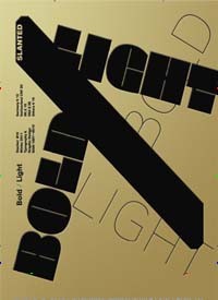
“Slanted Magazine #16 – Bold / Light”
EUR 12.00
BOLD/LIGHT is contrast. The new issue deals with the loud and the silent, the eye-catching and the inconspicuous. BOLD is the opposite of despondent. In typography it is a popular method of accentuation. LIGHT is the opposite of noisy and bigmouthed. We are impressed of a time – striking and epic in its occurrences – which rushes past and carries us off. So, how can we pause, set the LIGHT against the BOLD? The fluid, cinematic moment of presentation has an exceptional meaning for us also in this issue. We are bothered about a linear concept of narration. The rhythmic comparison encourages to stay and immerse. Creative decisions and the use of typography for this compilation were stretched far to specific borders, to underline the topic and to work out the character of the two extremes.
What do you think of this issue?
Sign up or Log in to join the discussion.